
Neety is an AI-powered message automation tool for prospecting and selling through LinkedIn messages.
Context
In early 2024 this sales-prospecting tool launched as an MVP with basic features. After a few months and the first customers, it became clear we needed to start building a more robust interface, optimize the flows and create a system that would let the product scale. Through Escuela Tribux, four classmates and I began collaborating with Neety.
The goal is to move from an MVP with a basic interface to a robust, consistent and easy-to-use tool.
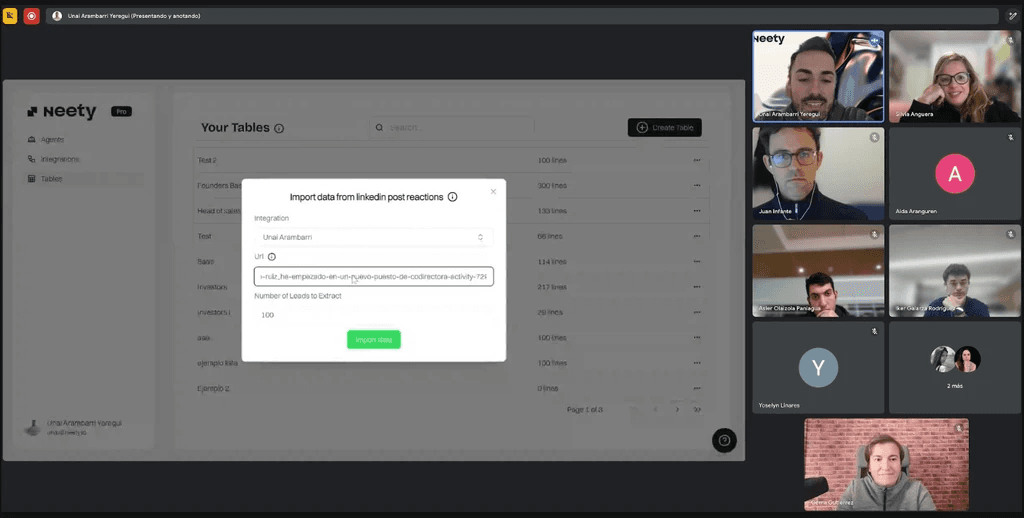
In the kickoff meeting, the team walked us through how the product worked and the design and usability needs. Next we would study similar tools on the market and the needs and friction of real and potential users.
Research
Over three months we carried out the following research:
Benchmark & competitive analysis
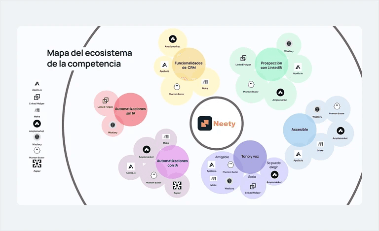
We started by analyzing the market with a full benchmark of direct and indirect competitors: features, strengths and weaknesses.
Qualitative user interviews
We ran 8 online interviews with current users and potential customers.
Research insights
The following business needs were validated during the research
Users need more control and tracking inside the platform, with more features.
CRM integration is key to optimizing the commercial workflow.
Validated value proposition: automating personalized messages improves prospecting and conversion.
Other insights to keep in mind
Users trust AI because they already use similar automation tools
Some features and labels cause confusion during use.
Users expect a more autonomous tool that needs less supervision.
Definition
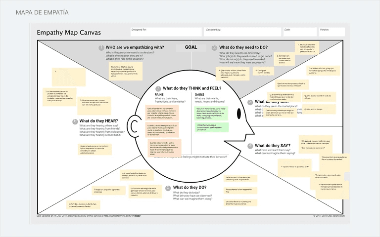
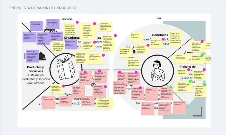
From these findings we worked on defining the tasks using tools such as an Empathy Map, grouping users’ motivations, frustrations and expectations. We then used a value-proposition canvas to address those needs and opportunities to improve the tool.
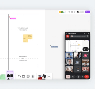
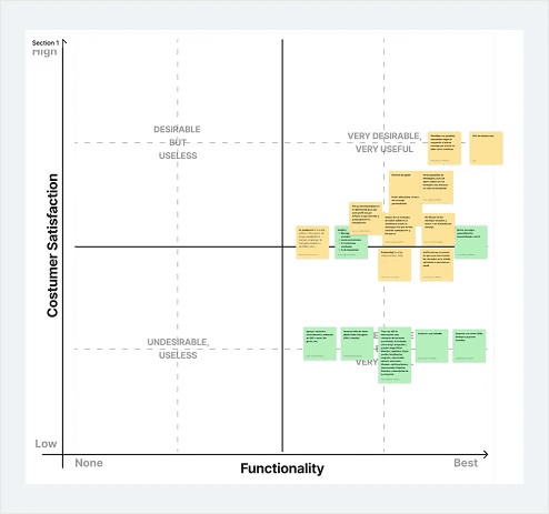
Kano model session
With that input we ran a collaborative session with the team to align business goals and user needs. We prioritized key features and improvements by impact, feasibility and user value, setting the product strategy and an initial roadmap.
Solutions
01.
Moodboard
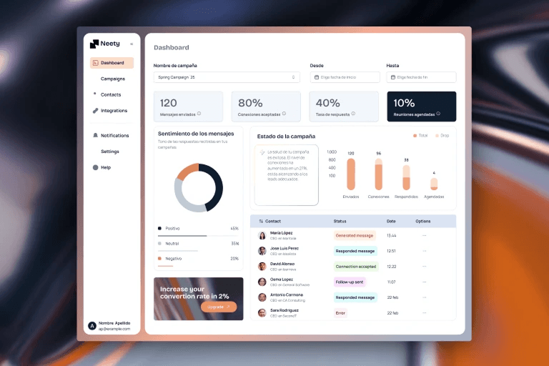
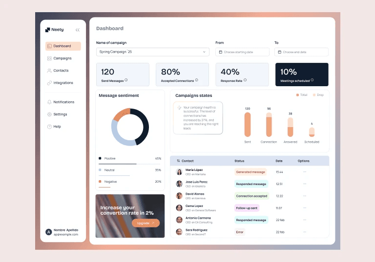
With the dashboard, users can see everything related to their campaigns and the impact and results they are getting, all at once.
02
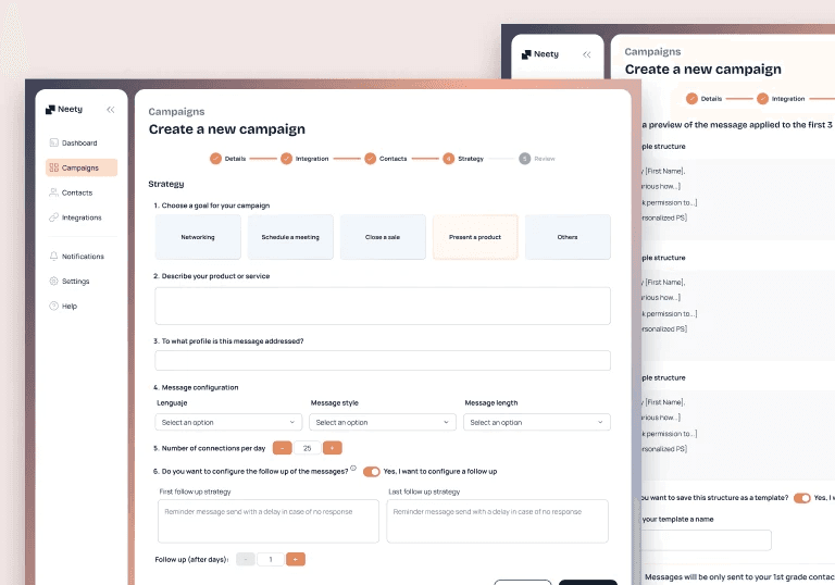
Improved campaign setup flow
This flow is the core of the product
03
UX writing
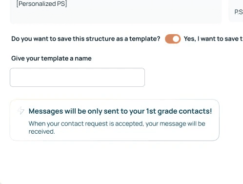
Closer, friendlier copy that avoids jargon and guides and informs the user at every step
04.
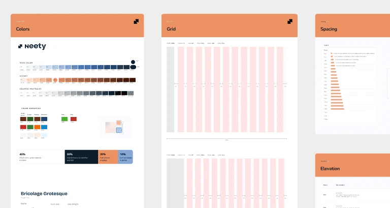
Design foundations
Color, type scale, grids per device
05.
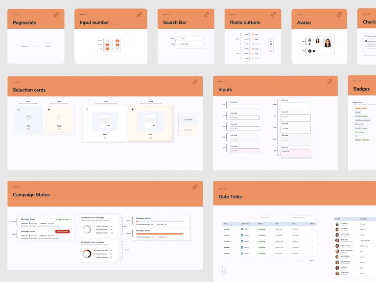
Component library
To scale the product consistently, we created all the components needed at that point
Usability testing
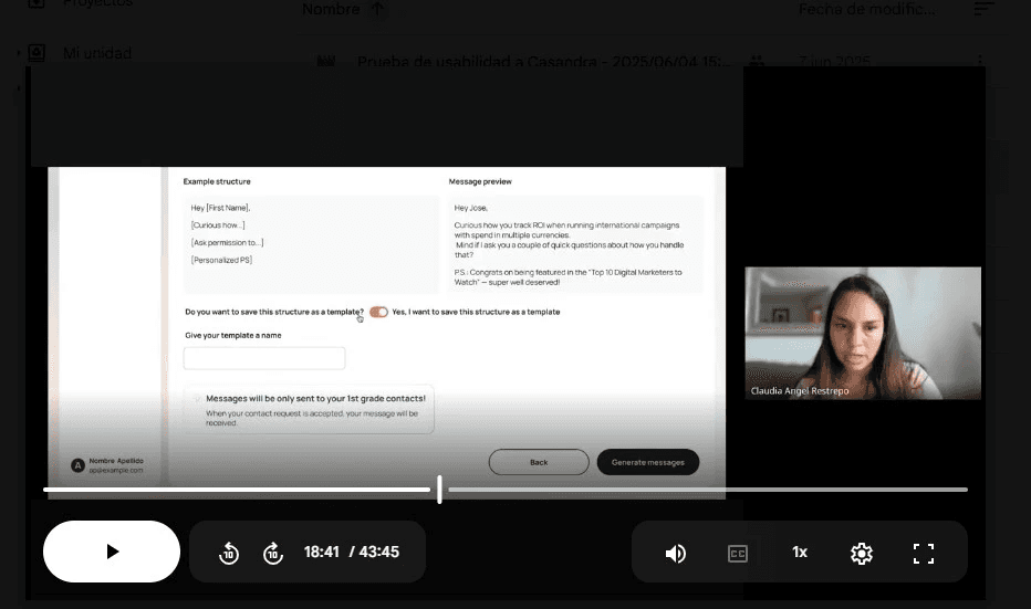
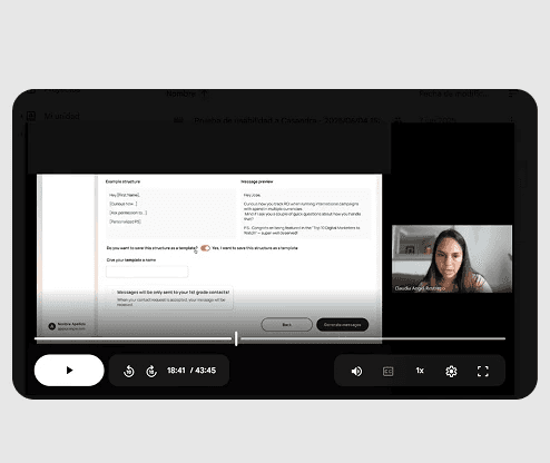
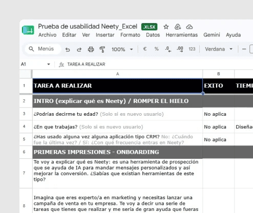
The prototype of the new design was validated with a usability test with 5 users representative of the target audience.
Sessions evaluated comprehension of the interface and the new features, which validated many of the earlier design decisions and surfaced new learnings and opportunities to improve the experience.
Test results
70%
Trusts the system more after seeing clear metrics on messages, replies and meetings
65%
Finds key information faster
75%
Values the change in copy and terminology